

Where to Next? - 3 Wayfinding Tips to Make a Smooth Visitor Journey
Step out of your front door, and there are wayfinding devices everywhere — a million different signs, maps, arrows guiding you through your day. “Turn Left”, “Entry”, “No Entry” “Walk this way”.
Showing The Way
Wayfinding is an important part of our work and we are always on the lookout for examples of where it’s done well, like here...

Spotted by travelling Story Inc’er: This beautiful little ‘breadcrumb-style’ wayfinding leads visitors to an extraordinary Cezanne exhibition in Aix en Provence, France.
…and not so well, like here…
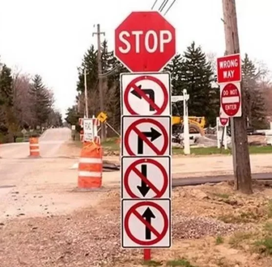
Wait, what!
A Clear Path
As part of the visitor experience design process, we have to think carefully about how to help visitors intuitively navigate their way into and through a space. We want them to spend their time enjoying inspiring, surprising, informative stories, being wowed by beautiful graphics and interactives; not wondering “where the heck do I go next?”

Guidebooks like this fun one we made for families visiting the National Museum of Singapore can be great wayfinding devices. Image credit: National Museum of Singapore
A Wayfinding Toolkit
There’s a whole lot of different wayfinding tools - from the old faithful text on signs and directional icons, to maps, unobstructed pathways, clear thresholds and landmarks and loads more. But with all of this at your disposal, what should be at the top of your mind when designing a visitor experience?
Here are Story Inc spatial designer Shenae Haswell’s Top 3 Wayfinding Tips
1. Research, Research, Research
Learn as much as you can about the space you are working in, and put yourself in the visitors' shoes. We often use imagined “visitor journeys” as well as a lot of visitor research to learn how others navigate a space and then respond with appropriate wayfinding solutions. This is also key for identifying potential hazards and accessibility issues.

Imagined visitor journey created for a recent exhibition at Singapore National Museum.
2. Define Your Spaces
Wayfinding isn't just about signs! It should be integrated into a space and work in tandem with other elements like colour, texture and light to clearly define spaces. Just like in an open-plan kitchen and living room where you can use different flooring in each space that says “now you’re in the kitchen...and now you’re in the lounge”.

Colours used to identify different zones in Future Makers, an exhibition for the Singapore Science Centre exploring the world of engineering.
3. And Keep It Clear
Be careful not to overwhelm visitors with a million signs, in wildly contrasting colours and in ALL CAPs and pointing in different directions!
Use clear fonts, good colour contrasts and recognisable symbols.

Here’s how we did it at the Museum of Siam, Thailand. We wove this stylised ribbon throughout the entire space as a physical wayfinding and storytelling device.
Ultimately, good wayfinding should kind of be invisible. Without a lot of fanfare, it should make for a smooth visitor experience where people remember wonderful content, not a bumpy ride.
Let us know the best (or worst) example of wayfinding you’ve seen :)